How to Implement a Dark Mode with CSS and 3 Simple Lines of Javascript
The beginners guide on how light/dark mode websites are made.
There's no denying that a must-have feature of most modern websites and web apps is the ability to toggle the site's theme from a light mode to that of a dark one, this feature has gradually become a trendy addition to the modern web, and knowing how to go about implementing it is undeniably going to come in handy when working on future projects or implementing it on pre-existing projects.
As with everything in programming, there are a thousand and more ways to go about doing anything, and implementing a dark mode on a website is no different... there are several ways but in this article, we'll be looking at one of such ways.
Prerequisite
Basic knowledge of HTML and CSS.
Very basic knowledge of JavaScript (or not as I'd explain everything)
You've read the article on how to make a CSS Toggle Switch (Optional)
Getting into CSS Custom Properties ( CSS Variables)
As in every programming language, variables are simply names given to memory locations where values can easily be stored, which then makes the variable reusable in our program rather than repeating/hardcoding the actual values in multiple places in our code. This as you probably know, makes it easy to implement a global change by changing the value of the variable where it is defined/declared, which in turn reflects in every instance of that variable (the value of the variable changes where ever the variable has been used).
Fortunately, CSS specification allows for the use of such variables known as custom CSS properties. These custom properties are defined as a name/value pair combination that can then be associated with an element. Defining the name of the variable is initiated using double hyphen/two dashes followed by the name of the custom property and finally assigning a value to it e.g:
example {
  --primary-color: #222;
}
To use this custom primary color property in a rule, you'd have to call the var() function with the name of the custom property passed to it. e.g.
example {
  background-color: var(--primary-color)
}
This as you'd have guessed, is the same as setting background-color: #222 because the variable --primary-color is a placeholder for the actual value it holds.
Scope
Depending on where these variables are defined, they can either have a global scope, which means they can be accessed and used anywhere in our stylesheet or a local scope that limits its usage to a specific rule. To give a variable a global scope, it would have to be stored in the :root pseudo-class selector in our stylesheet. This :root selector targets the root element in our HTML markup, which is the <html> element in our document. You can simply think of the :root selector as a representation of the <html> element but with higher specificity(priority).
:root {
  --primary-color: #222;
}
By declaring this variable in the root selector pseudo-class, it is given a global scope and can be used anywhere in our stylesheet. E.g:
h1 {
  color: var(--primary-color)
}

div {
  background-color: var(--primary-color)
}
To give a variable a local scope, it would have to be defined in a ruleset and will only be accessible within that ruleset (local scope). E.g:
element {
  --primary-color: #fff;
  color: var(--primary-color);
  border: 2px solid var(--primary-color)
}
Overriding Global Variables with Local Variables
The most interesting feature of these variables is the fact that when a variable that is already defined in the :root (global scope) is redeclared in a ruleset (local scope) with a new value, the new value overrides that of the global scope, but only within that ruleset. E.g:
:root {
  --primary-color: #222;
}
h1 {
  --primary-color: #4169e1;
  color: var(--primary-color);
}
h2 {
  color: var(--primary-color)
}
Output👇

Implementing a Dark Mode Feature
With our current knowledge of CSS variables, implementing a dark mode feature is pretty straightforward. For this tutorial, we'll be using a CSS toggle switch previously made in a different article, you can quickly jump to that article if you are curious about how this toggle switch was made.
HTML Markup
For the HTML markup, we'll simply place this toggle switch and a div containing a bunch of content
  <body>
    <!-- Toggle Switch -->
    <div class="switch">
      <input type="checkbox" id="switch" />
      <label for="switch">
        <i class="fas fa-sun"></i>
        <i class="fas fa-moon"></i>
        <span class="ball"></span>
      </label>
    </div>

    <!-- Content of Our Webpage -->
    <div class="content">
      <h1>Heading</h1>
      <p>
        Lorem ipsum dolor sit amet consectetur adipisicing elit. Expedita, non?
      </p>
    </div>
  </body>
Output👇

To keep things simple, that's all the HTML we'll be needing for this implementation. The idea is that the content section represents the entire content of our webpage and the toggle is what we click on to trigger a change in our webpage.
CSS Markup
This is where our CSS custom properties (variables) play a key role, the concept is that rather than using hardcoded values for styling our site's color scheme (various colors on our site), we store the color scheme of the site's initial mode (light mode) as variables in the :root (global scope) of our stylesheet and then use these variables in places where we'd normally use normal hardcoded values. So let's do just that:
:root {
  --bg-color: #fff;
  --primary-text-color: #222;
  --secondary-text-color: #444;
}
We've created three custom variables in our global root element, now we'll proceed to style our webpage using these variables. Let's start by centering everything on the webpage using flex, giving our webpage a background color and giving the content two distinct colors using these variables.
body {
  display: flex;
  height: 100vh;
  flex-direction: column;
  justify-content: center;
  align-items: center;
  background: var(--bg-color);
}
.content {
  color: var(--primary-text-color);
}
.content p {
  color: var(--secondary-text-color);
}
Output👇

Now we are going to create a dark theme class ruleset and redefine our global variables with new values that are tailored for a dark mode outlook.
.dark-mode {
  --bg-color: #3e4c59;
  --primary-text-color: #fff;
  --secondary-text-color: #ddd;
}
The new values in the dark-mode class is what will be used to override the values of the global variables whenever the toggle is switched on, this is done by using JavaScript to add this newly created .dark-mode class to our <body> element... meaning any element within the scope of the body of our webpage will have the dark mode applied to it.
The 3 Magic Lines of JavaScript :)
const switchTheme = document.querySelector("#switch");

switchTheme.addEventListener("click", function () {
  document.body.classList.toggle("dark-mode");
});
For those new to or unfamiliar with JavaScript, here is the breakdown of what the code above is doing:
const switchTheme = document.querySelector("#switch"): We are simply asking JavaScript to query the DOM (look for an element in the webpage) that has an ID of switch, and then store this element in a constant variable.switchTheme.addEventListener("click", function () {}: Now accessing that toggle element using the variable name, we ask JavaScript to listen to a click event and when this click happens, it just runs a function that holds our code.document.body.classList.toggle("dark-mode"): As you can guess, we are selecting the<body>element of our webpage and saying check if this element has a class of 'dark-mode', if it doesn't add that class. But if it already does, remove the class.
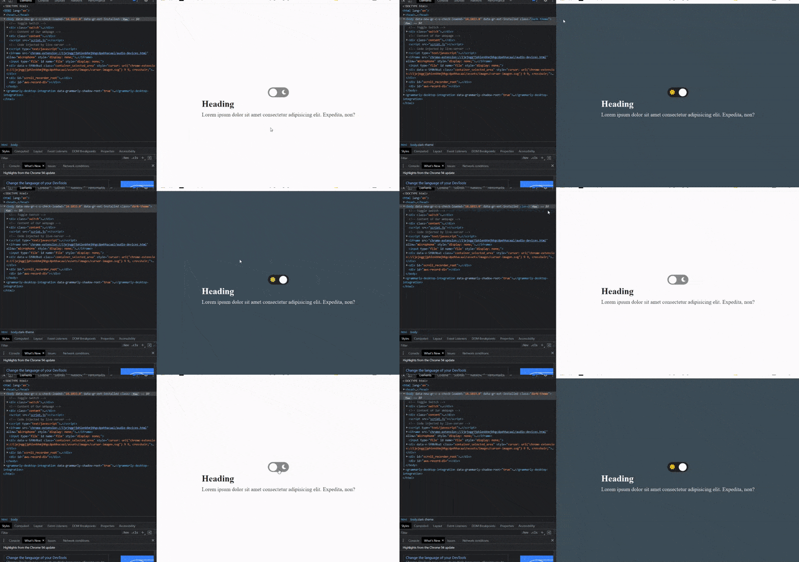
Output👇

Notice what's going on under the hood?

Our dark-mode class gets added to the body of our document when the toggle is clicked on, which prompts all the values of the custom CSS properties used all over our webpage to get overridden with the new values in the dark-mode class. Clicking on it again removes this class which results in our initial global variables taking effect again.
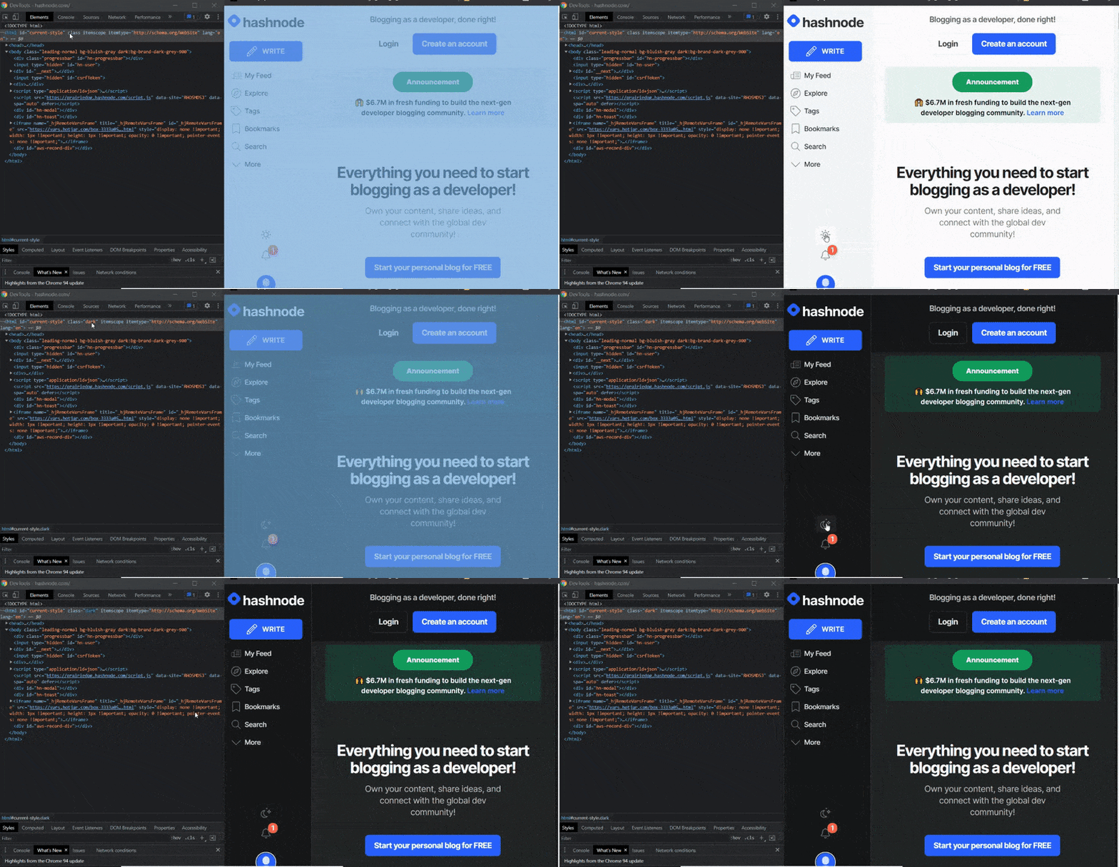
Now let's take a peek at Hashnode's own implementation of their dark mode:

Notice it's basically the same but they're simply adding theirs to the <html> element.
Conclusion
Congrats on getting to the end of this article.🎉 As a side note, I'd like to point out a particular implementation I came across a while back, in this tutorial the instructor wanted to implement an option for users to be able to select between 3 color modes on a website (light, dark and blue mode), so he had the initial style of the website copied into several stylesheets and manually edited each stylesheet to match the theme of choice and then used Javascript to dynamically swap the stylesheet link to that of the users choice on click.
It worked as intended, but thinking back there was something I found strange with the implementation, when an option was clicked on there was a visible 1 - 2 seconds delay before the new theme took effect and that had left me wondering why. Knowing better now, this delay was a result of the browser downloading the new stylesheet and applying it, hence the slight delay. As you can guess, this is not very performant or friendly to the user's experience but you are free to experiment.
Support
If you found this article helpful (which I bet you did 😉), got a question? or spotted an error/typo... do well to leave your feedback in the comment section. And lastly, someone might be somewhere struggling to implement a dark mode, do well to share this resource and follow me for more.
And if you're feeling generous (which I hope you are 🙂) or want to encourage me, you can put a smile on my face by getting me a cup (or thousand cups) of coffee below. :)